

A subtle light sweep across your logo can make the menu bar feel more alive, especially if your logo is text-based. From what Lucid Gen has seen, this effect works best for websites with a colored logo on a white menu bar. Give it a try on your own logo, your site might look better. ^_^
Steps to add a light sweep effect to your website logo
Find the CSS element that wraps the logo
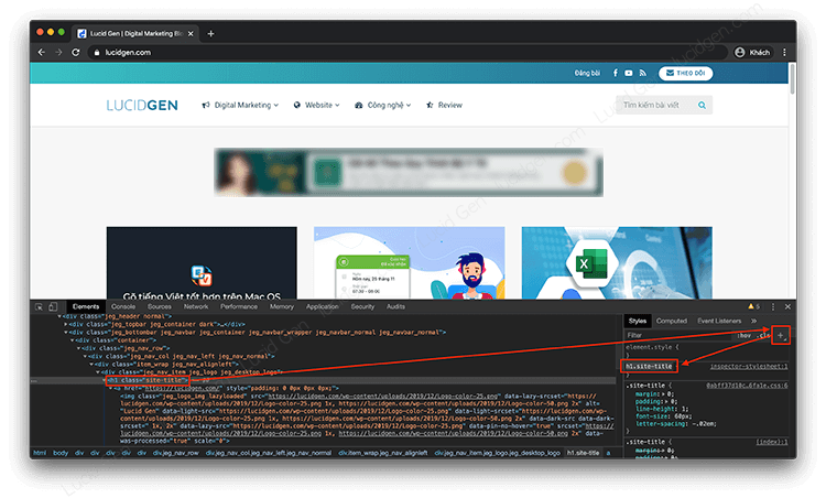
On your website, right-click the logo and select Inspect to open the browser’s Elements panel.

Look for the element that wraps your logo image. In Lucid Gen’s example it is <h1 class=”site-title”>, so the CSS selector can be either .site-title or h1.site-title. You can get it quickly and accurately by selecting that element’s line and clicking the plus button “+” as shown in the image below.
Tip: it’s usually not the <img> or <a> tag, but an <h1> tag or whatever sits right above the <a>.
Put your element into the light sweep code
There are 2 styles to choose from. Style 1 is the one Lucid Gen uses, with 2 rays of light crossing each other. Style 2 is like the one on canhme.com, with a single tilted ray sweeping from left to right. Which one you pick is entirely up to you ^_^.
Put your CSS element into the two code snippets below to see which one suits your logo. Replace the part in front of :before or :after, right before the colon.
Horizontal light sweep effect
/* CSS Horizontal light sweep effect logo by LucidGen.com */
/* Edit h1.site-title to your CSS element*/
h1.site-title:after,h1.site-title:before{content:"";position:absolute;top:50%;width:10px;height:100%;transform:translateY(-50%);background-color:rgba(255,255,255,.75);z-index:999999999}
h1.site-title:before{left:-5%;animation:light-left 2.5s infinite alternate linear}
h1.site-title:after{right:-5%;animation:light-right 2.5s infinite alternate linear}
@keyframes light-left{0%{left:-5%;opacity:0}50%{left:50%;opacity:1}to{left:105%;opacity:0}}@keyframes light-right{0%{right:-5%;opacity:0}50%{right:50%;opacity:1}to{right:105%;opacity:0}}Tilted light sweep effect
/* CSS Inclined light sweep effect logo by LucidGen.com */
/* Edit h1.site-title to your CSS element*/
h1.site-title:before{content:"";position:absolute;width:300px;height:25px;background-color:rgba(255,255,255,.5);-webkit-transform:rotate(-45deg);-moz-transform:rotate(-45deg);-ms-transform:rotate(-45deg);-o-transform:rotate(-45deg);transform:rotate(-45deg);-webkit-animation:searchLights 1.5s ease-out 1s infinite;-o-animation:searchLights 1.5s ease-out 1s infinite;animation:searchLights 1.5s ease-out 1s infinite}
@-webkit-keyframes searchLights{0%{left:-100px;top:0}to{left:250px;top:0}}@-o-keyframes searchLights{0%{left:-100px;top:0}to{left:250px;top:0}}@-moz-keyframes searchLights{0%{left:-100px;top:0}to{left:250px;top:0}}@keyframes searchLights{0%{left:-100px;top:0}to{left:250px;top:0}}
@lucidgen
Add it to your website and check the result
Once you’ve edited the code, copy it into one of these 2 places.
- The theme’s style.css file.
- The Additional CSS section in the WordPress Customizer.
If your website doesn’t run on WordPress, wrap the code in <style> and </style> tags and insert it as HTML.
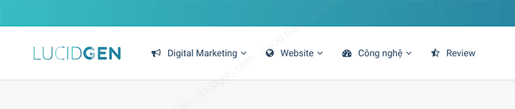
Here is the result. It’s a bit hard to see in a screenshot, so take a look at the Lucid Gen logo above the menu instead. ^_^

Final thoughts
With just a few steps, your plain logo becomes livelier and a bit more polished. Don’t forget to add your logo to your photos too, so customers remember your brand better. If you get stuck or can’t figure out which CSS element to use, leave a comment below and I’ll help you find it for free. And if it worked, feel free to comment and show off your logo ^_^.


